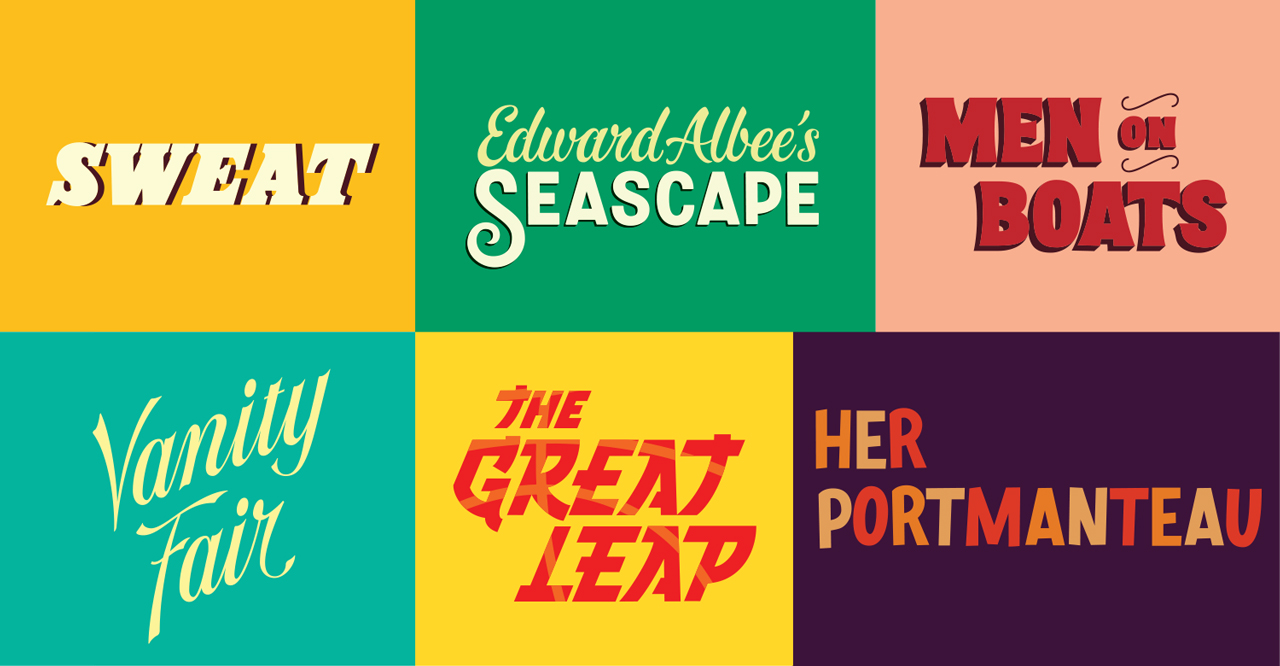
Background
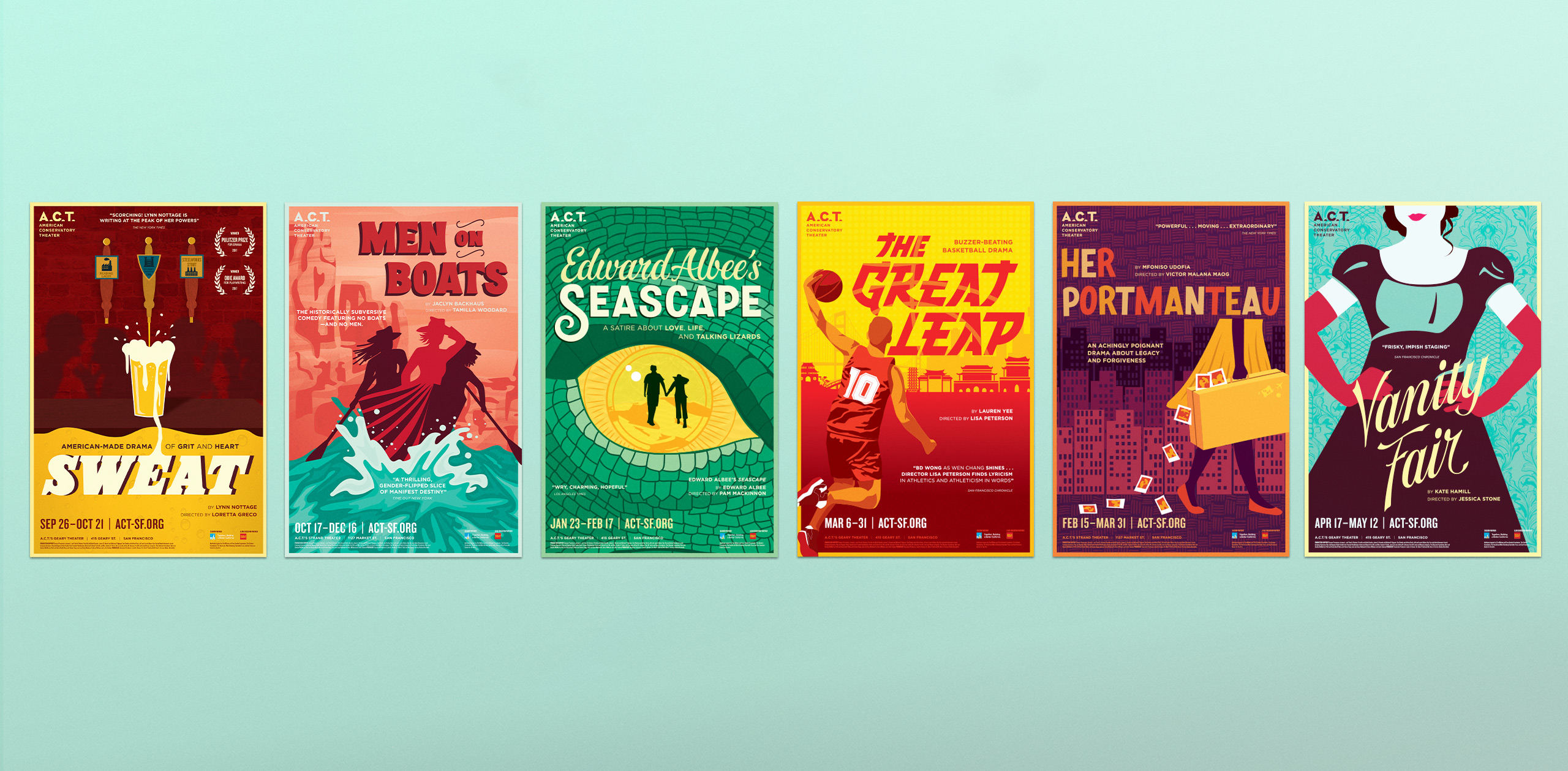
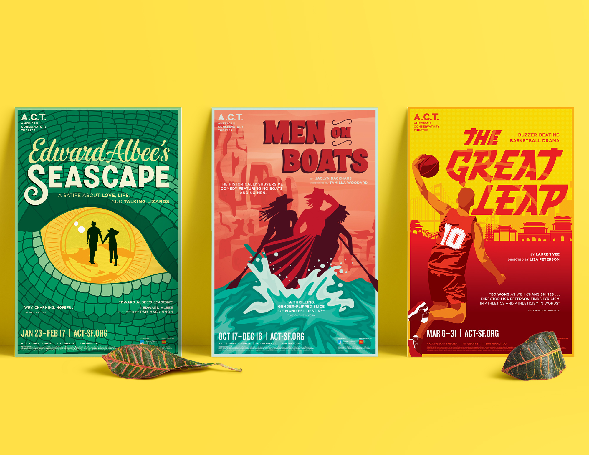
We were commissioned to create season artwork for the the California Bay Area's largest non-profit theater, American Conservatory Theater (A.C.T.). In previous years, all of their posters had completely different looks within one season, with the art being entirely defined by the show and the artist who made it.
With the addition of a new artistic director, Pam Mackinnon, and a collection of shows that shared themes of exploration, we decided to give A.C.T.’s season a fresh look that was removed from stock imagery and was created entirely by hand. We also created hand-lettered title treatments for each show, giving both the art and the titles (which often were displayed separately) the flexibility necessary for their many mediums.
Background
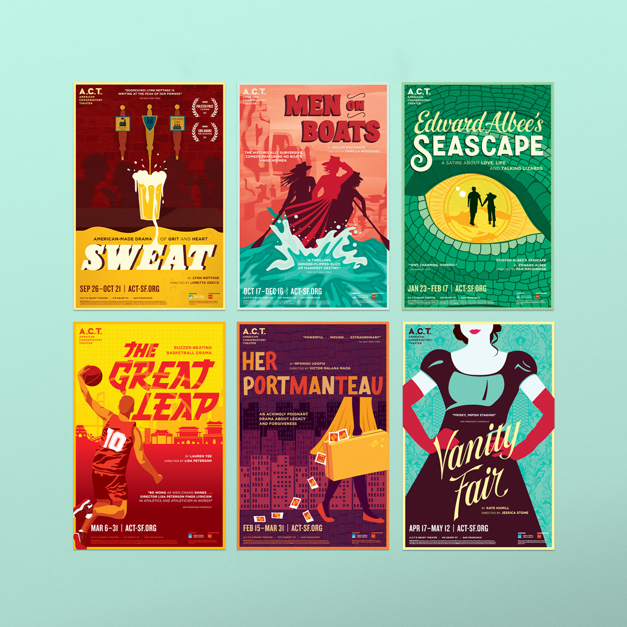
We were commissioned to create season artwork for the the California Bay Area's largest non-profit theater, American Conservatory Theater (A.C.T.). In previous years, all of their posters had completely different looks within one season, with the art being entirely defined by the show and the artist who made it.
With the addition of a new artistic director, Pam Mackinnon, and a collection of shows that shared themes of exploration, we decided to give A.C.T.’s season a fresh look that was removed from stock imagery and was created entirely by hand. We also created hand-lettered title treatments for each show, giving both the art and the titles (which often were displayed separately) the flexibility necessary for their many mediums.
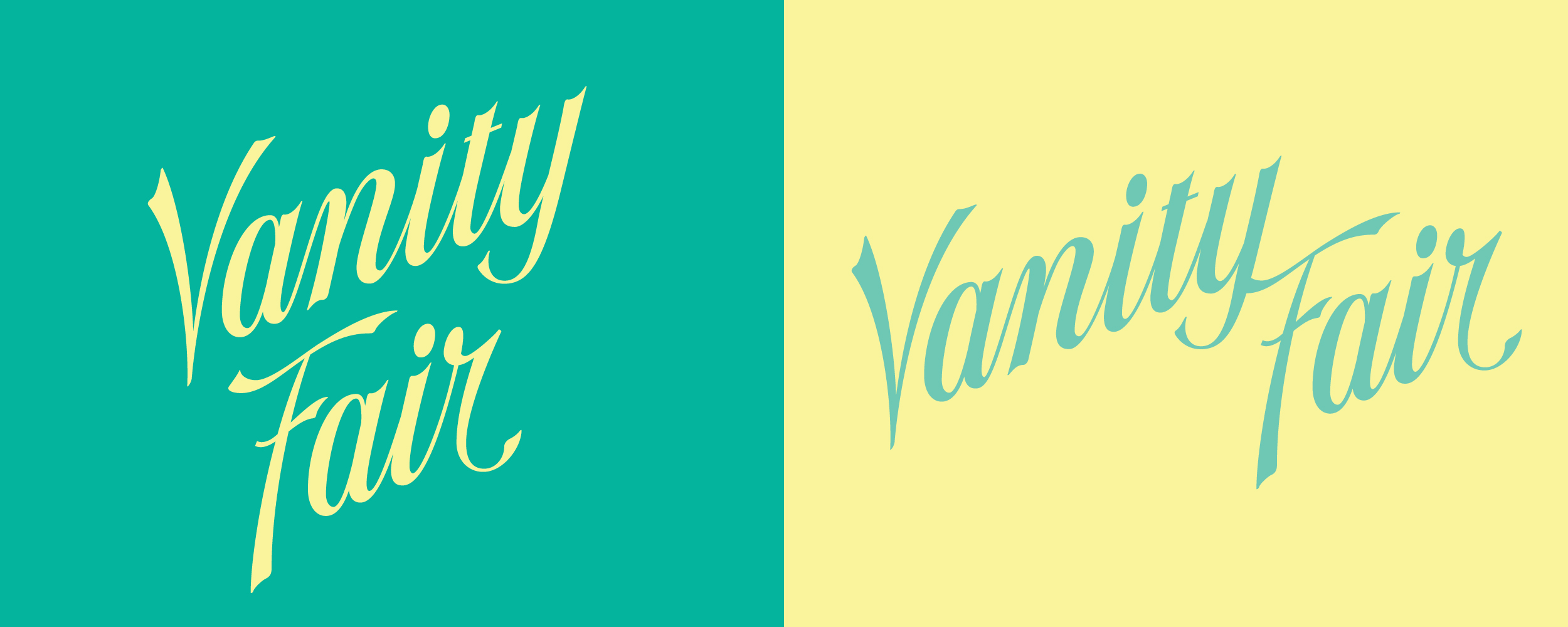
Background
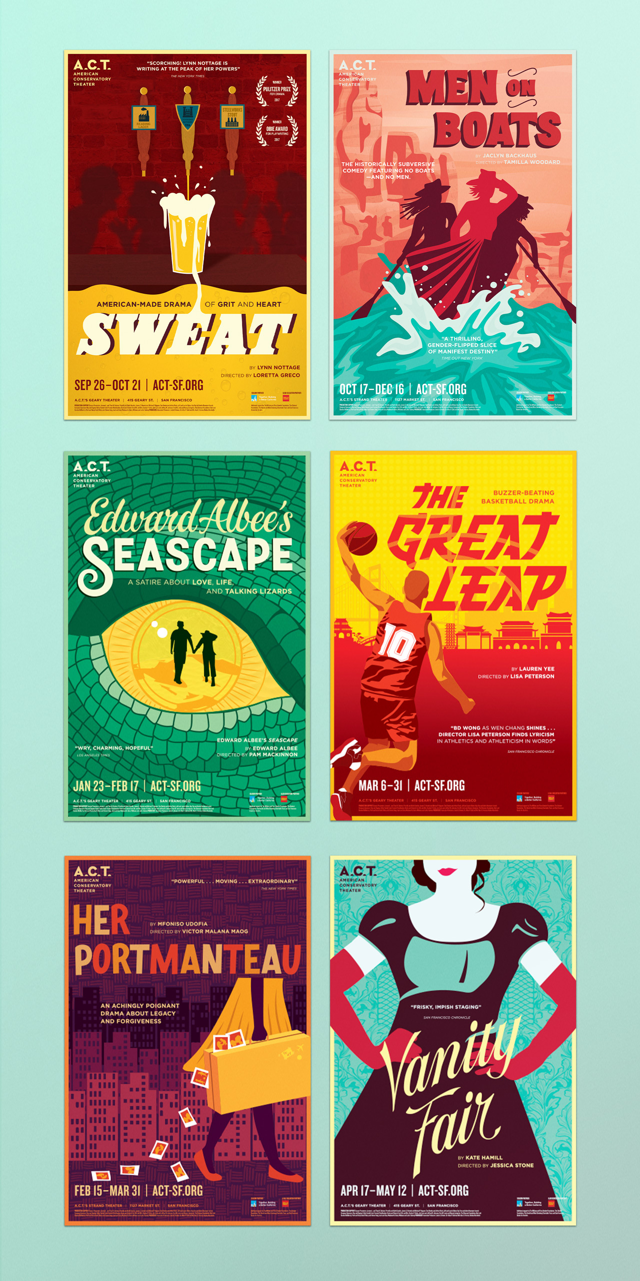
We were commissioned to create season artwork for the the California Bay Area's largest non-profit theater, American Conservatory Theater (A.C.T.). In previous years, all of their posters had completely different looks within one season, with the art being entirely defined by the show and the artist who made it.
With the addition of a new artistic director, Pam Mackinnon, and a collection of shows that shared themes of exploration, we decided to give A.C.T.’s season a fresh look that was removed from stock imagery and was created entirely by hand. We also created hand-lettered title treatments for each show, giving both the art and the titles (which often were displayed separately) the flexibility necessary for their many mediums.
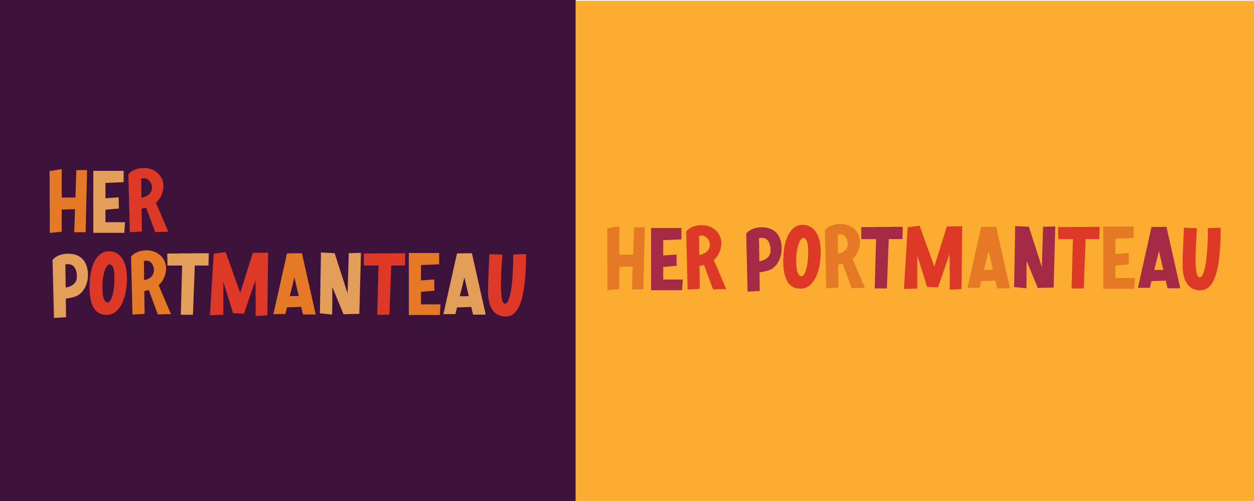
Background
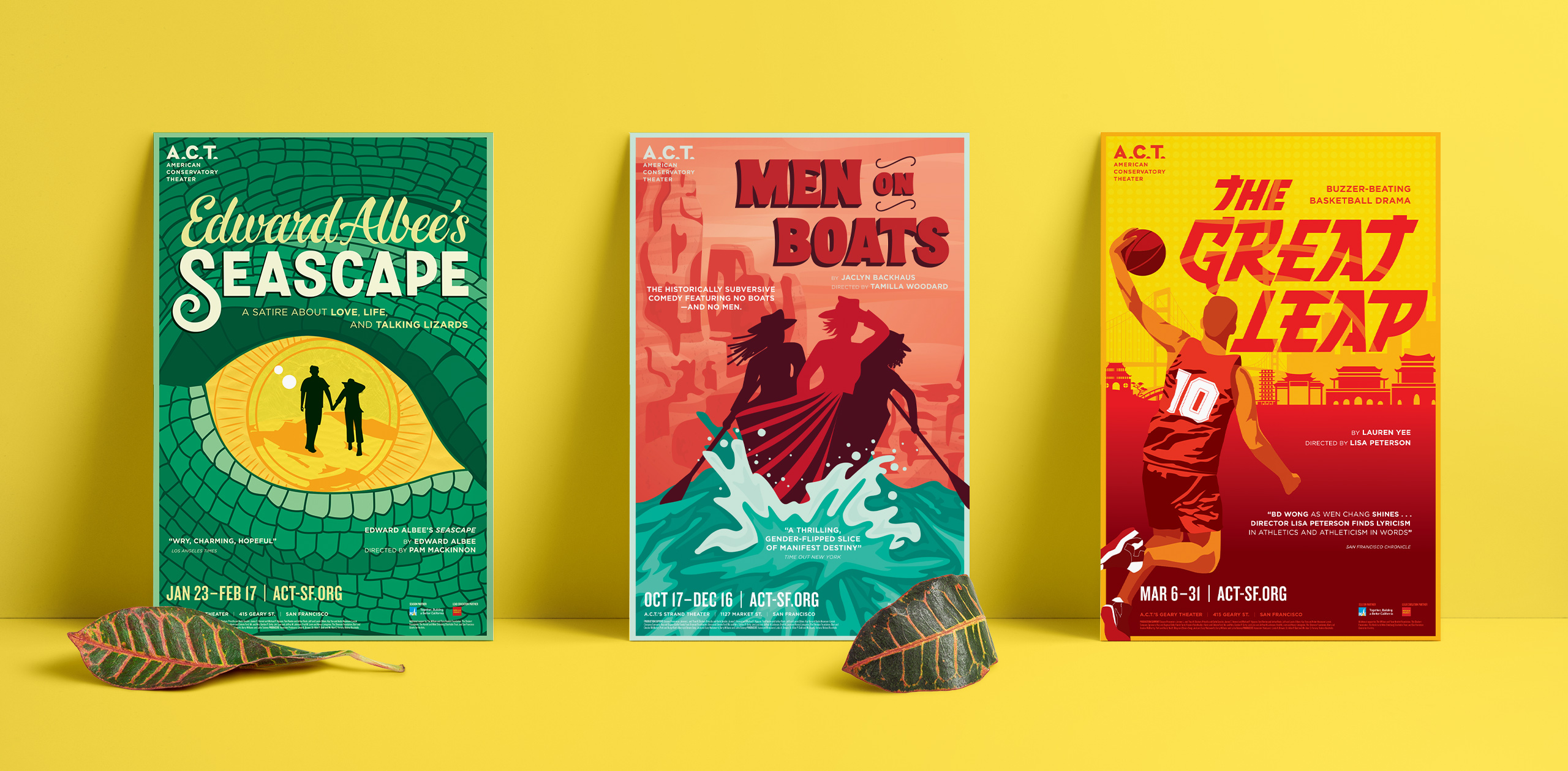
We were commissioned to create season artwork for the the California Bay Area's largest non-profit theater, American Conservatory Theater (A.C.T.). In previous years, all of their posters had completely different looks within one season, with the art being entirely defined by the show and the artist who made it.
With the addition of a new artistic director, Pam Mackinnon, and a collection of shows that shared themes of exploration, we decided to give A.C.T.’s season a fresh look that was removed from stock imagery and was created entirely by hand. We also created hand-lettered title treatments for each show, giving both the art and the titles (which often were displayed separately) the flexibility necessary for their many mediums.
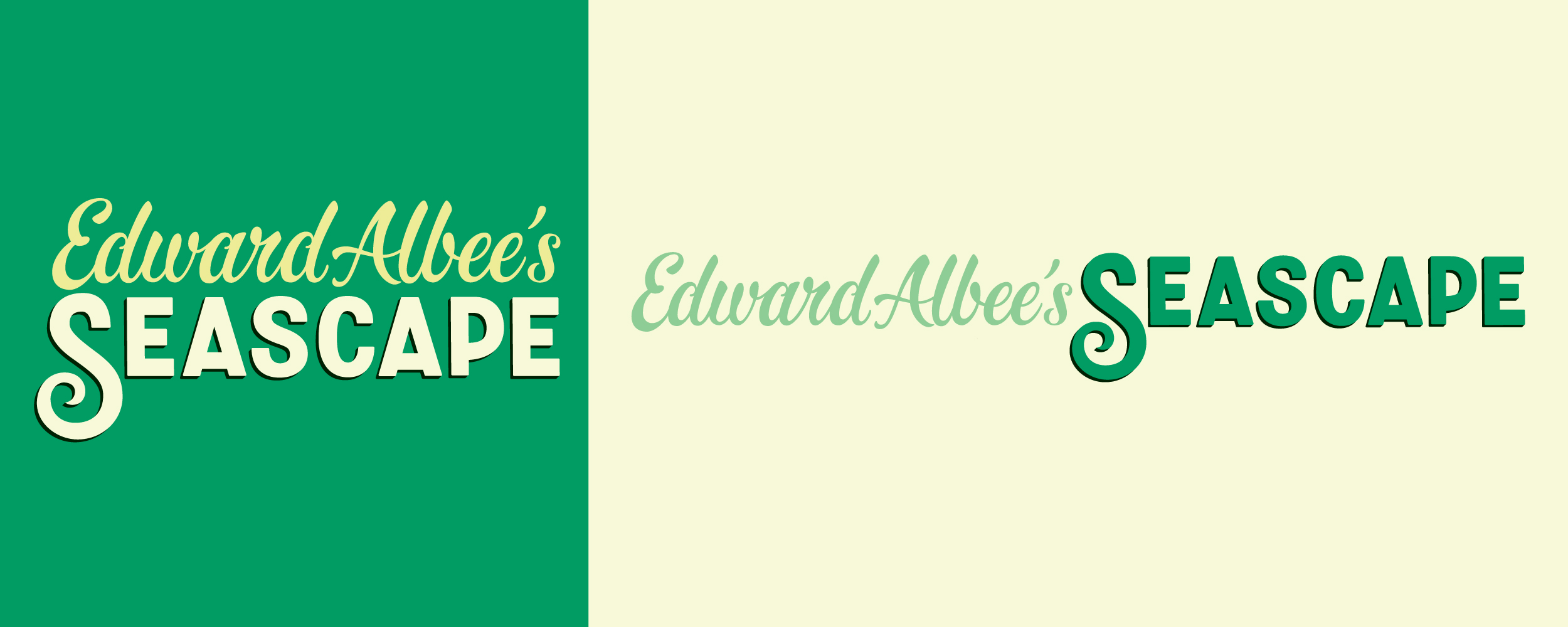
Background
We were commissioned to create season artwork for the the California Bay Area's largest non-profit theater, American Conservatory Theater (A.C.T.). In previous years, all of their posters had completely different looks within one season, with the art being entirely defined by the show and the artist who made it.
With the addition of a new artistic director, Pam Mackinnon, and a collection of shows that shared themes of exploration, we decided to give A.C.T.’s season a fresh look that was removed from stock imagery and was created entirely by hand. We also created hand-lettered title treatments for each show, giving both the art and the titles (which often were displayed separately) the flexibility necessary for their many mediums.
Services
Branding
Identity
Illustration
Lettering
Print Design
Services
Branding
Identity
Illustration
Lettering
Print Design
Services
Branding
Identity
Illustration
Lettering
Print Design
Services
Branding
Identity
Illustration
Lettering
Print Design
Services
Branding
Identity
Illustration
Lettering
Print Design